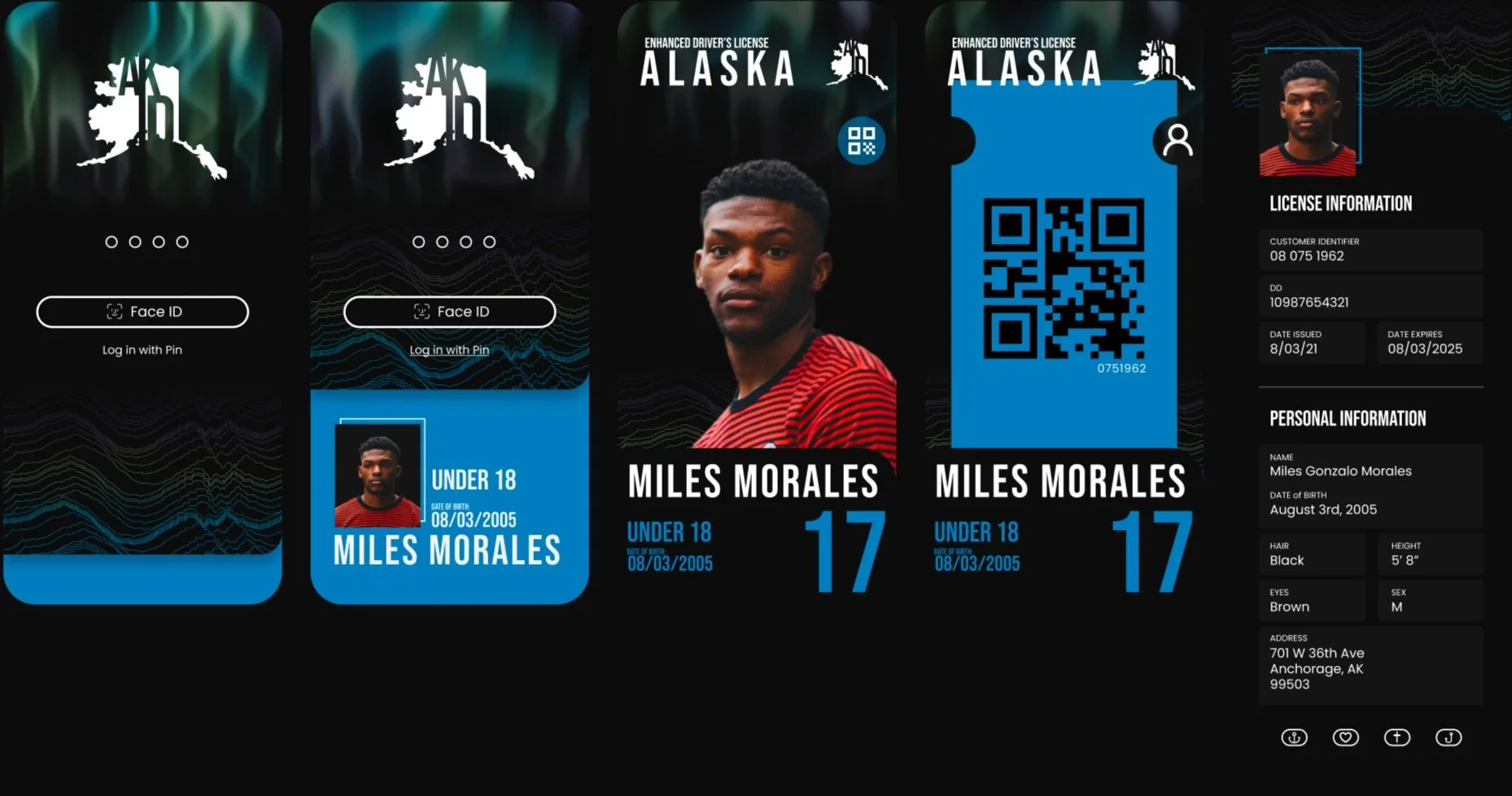
Overview
Digital State ID
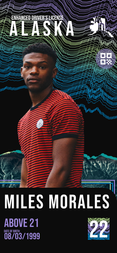
With this project, I wanted to create a way for users to quickly and easily provide their identification in any scenario. It is becoming more and more common for our lives to be kept on our mobile devices, it seems like one of the last things to integrate into this lifestyle seems to be the drivers license or personal ID. It’s time we created an application that can be used for this exact purpose.
Roles Performed:
UX/UI Design, Visual Design, Mobile Design
software:
Figma
Time Spent:
6 weeks
Problem
How can we help provide a secure identification experience without causing a major change in the users existing habits?
There are major issues with the current state of physical identification such as an easy access to forgery, easy to loose, and of course poor design.
Project Goal
Create a means of identification for a digital device that improves upon the existing physical ID and removes the issues that currently exist with the physical ID
Competitive Analysis
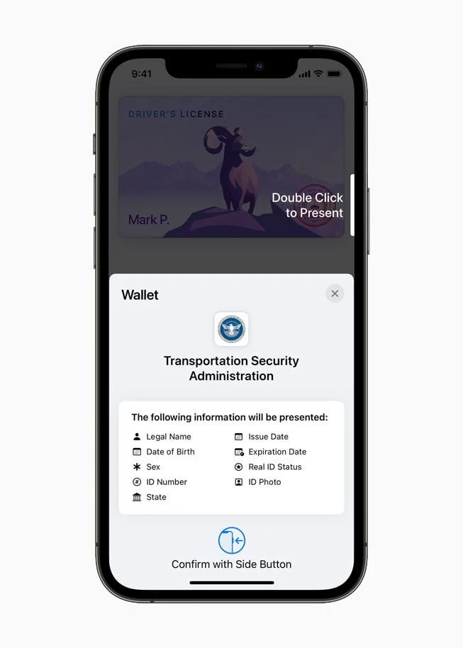
Apple Digital ID
Pros:
Pleasant and cohesive design that looks good and is easy to use.
Not state specific and can be used regardless of where in the country the user is.
Compatible with popularly used products such as apple watch, apple wallet, and iphone.
Cons:
The growing fear of large corporations gaining access to the users personal data
Excludes users unfamiliar with apple products or those who choose to not use apple products
Unclear how well it detects fake IDs and how well it stops their use.
Inspiration
Keywords
Modern
Bright
Geometric
Clean
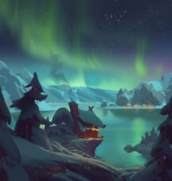
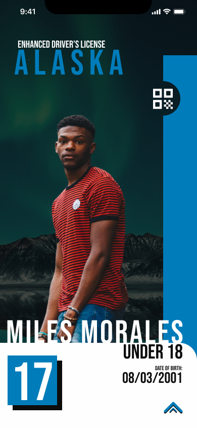
For this project, I was inspired mainly by the Northern lights that are so prevalent in Alaska, as well as the sleek and clean designs of modern applications.
Bright Minimalist
Sketches and Wireframes
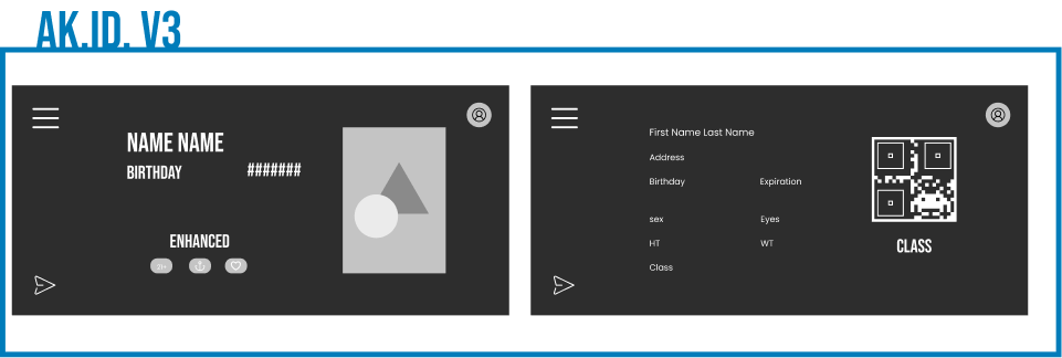
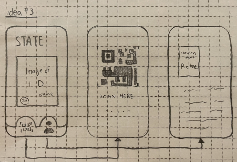
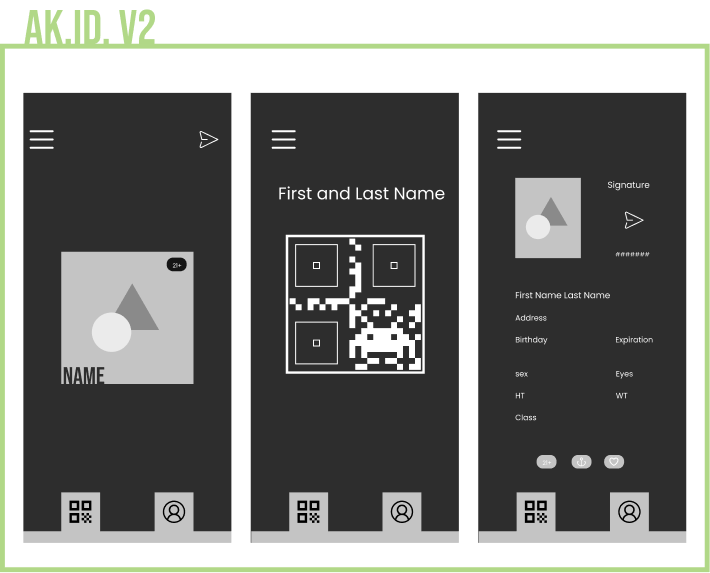
For my third idea I wanted to play around with a potential horizontal view. Many current digital IDs use this unsuccessfully, I was hoping with this one to do what they could not and make this work.
The problem I seemed to be running into with my ideas thus far seemed to be with placement of navigation. I originally wanted to avoid basic or possibly overused aspects but as I went out found that they are used so often because they work. This iteration tested out a basic bottom navigation bar.
Design Iterations
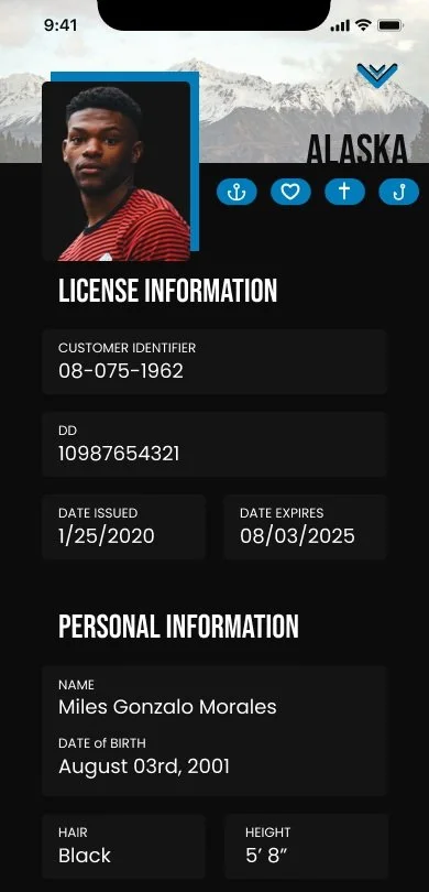
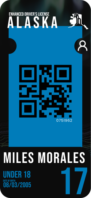
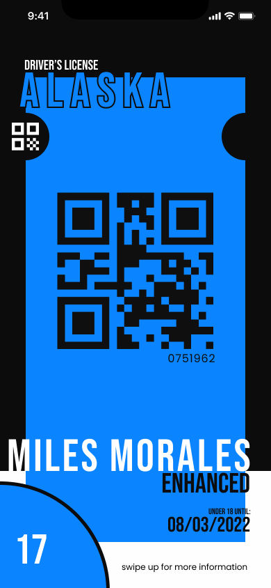
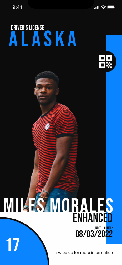
I decided to go with my first design with “Miles”. I liked the style and the interactions but got a lot of feedback saying it didn’t feel like Alaska, which was part of my goal for this project. I changed some colors and the background to better fit what I wanted out of this.
A big source of admiration for this design came from the logo in screen. For this pass, I made the style more like the original idea, while keeping the feeling I wanted from the state. Making everything more cohesive and fixing some issues with alignment, color, and spacing
I wanted to keep the vibe and the feeling of the previous design, while also creating a background that wasnt overpowering to the main information conveyed. I think the organization of the information was good and worked well so I kept this the same.
Final Thoughts
I’m very happy with where this design ended up. Unlike previous projects, I allowed myself to pay arround with styles, designs, and layouts and I think that freedom overall really ended up making the whole thing so much better. I also think that this design heavily benifited from peer feedback as well. Overall I think my biggest take away from this was the importance of iterations and trying things out. I believe that if I had just stuck with my first design and not updated it, it wouldn’t be as successful.
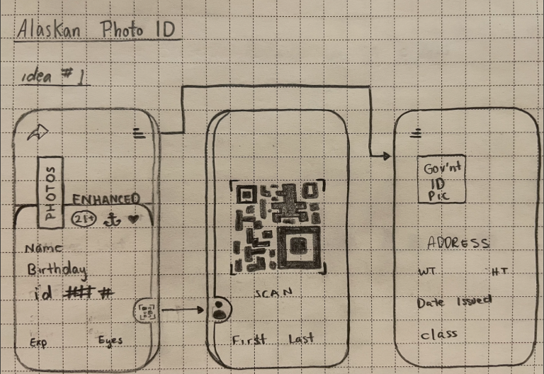
After researching, and also a bit while I looked into things, I began sketching Ideas for what I’d want this app to look like. I took the parts I thought would be most important in an app like this and played around with where I would want these pieces to go.
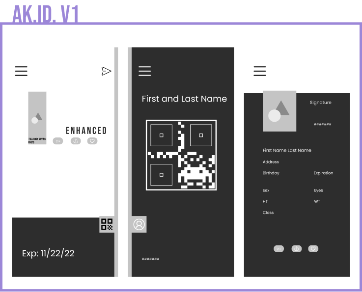
This part was a lot of trying stuff out. I played around a lot with which wireframe Id use for my main design and then just placement of the details. I created two finalized versions based on the first wireframes I created. While I liked these designs, They didn’t have enough of that Alaskan feeling to stick with it. I liked the layout and the designs


